Collars
UX improvements to onboarding, Home and Profile screens for a startup’s mobile app.


Process overview
Requirements intake and gathering
Competitive analysis
Low fidelity wireframes
High fidelity design
Iterative improvements
Requirements intake
The team received an initial set of requirements to:
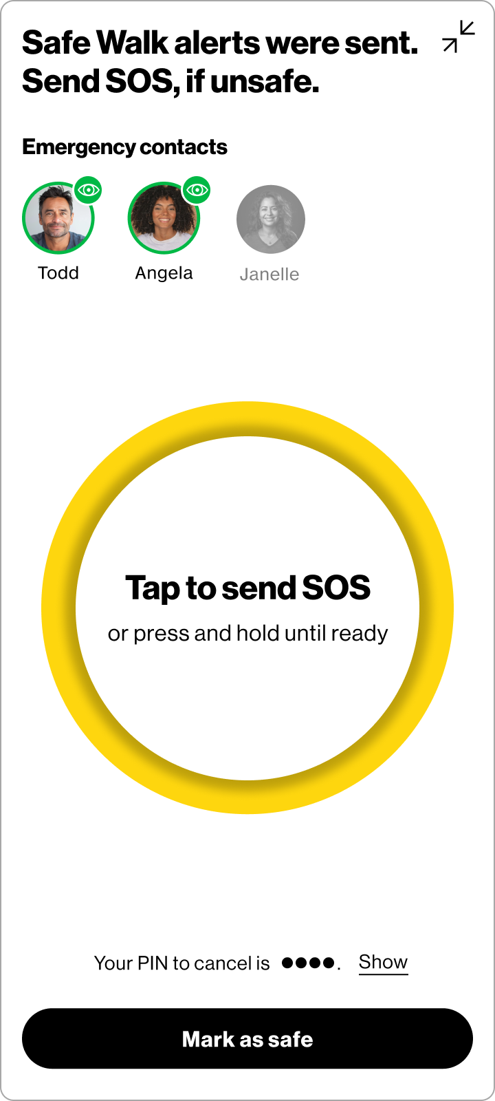
design a feature that allows users to live share their location with selected emergency contacts
allow the user to escalate to an SOS state if they find themselves in a dangerous or uncomfortable situation
Competitive analysis
The team looked across multiple competitors and analogous experiences. This included analyzing other safety-related mobile apps and native mobile device safety features.


Low fidelity design
Our low fidelity design phase consisted of creating user flows and designing low to mid-fidelity screens for the most common use cases.

High fidelity design
The high fidelity design phase consisted of iterative design updates based on user research and feedback between my design team, product owners and development leads.
