Verizon Family App: Safe Walk & SOS
End-to-end product design for a safety feature in Verizon's Family App, helping users share location and escalate to an SOS state during urgent situations.


Role & Scope
As a lead designer on a cross-functional team, I led the end-to-end UX design of Safe Walk and SOS: a safety feature shipped to hundreds of thousands of Verizon Family App users. Over the course of a year-plus engagement, I drove the feature from initial requirements through iterative testing to a full launch, collaborating closely with product and engineering to bring it to life.
Process overview
Requirements Gathering
Competitive Research
Low-Fidelity Design
High-Fidelity Design & User Testing
Iterative Refinement
Requirements Gathering
Families and partners needed a way to stay connected during everyday moments that carry real risk: a teenager walking home from school, a partner commuting late at night, a child spending time away from home for the first time. The goal wasn't to design for emergencies alone, but to bring ongoing peace of mind to guardians and loved ones across a range of situations where uncertainty can feel unsettling.
The initial requirements centered on two core capabilities: live location sharing with trusted contacts, and a clear, reliable path to escalate to an SOS state when a situation turns urgent. These anchored every design decision that followed.
Competitive Analysis
We conducted a broad competitive review spanning OS-native safety features on iOS and Android, family safety apps like Life360 and Find My, and personal safety apps like bSafe and Noonlight. This gave us a wide lens on how the space approaches location sharing, emergency escalation, and real-time feedback across different user contexts and needs.
Three design principles emerged from the analysis to guide our work:
Clarity: users must understand what's happening in real time.
Trust: safety features rely on consistent, predictable feedback.
Immediacy: critical actions must be effortless and obvious.
These principles became the foundation against which every design decision was evaluated throughout the project.


Low fidelity design
In the low-fidelity phase, we mapped the core user journeys for both the sender and receiver: the person sharing their location and the guardian monitoring it. A key early priority was minimizing the number of steps to initiate a Safe Walk or trigger SOS, recognizing that these actions often happen in moments of stress, limited attention, or physical movement.
Early feedback consistently validated one insight: users needed active reassurance that the system was working. Knowing that their location was being shared and that help was reachable was as important as the feature itself. This shaped how we approached feedback states and visual communication in the high-fidelity phase.

High Fidelity Design & User Testing
The high-fidelity phase spanned multiple rounds of iteration informed by user testing and cross-functional feedback. Visual hierarchy, button states, alert language, and active-state indicators were each refined to ensure users felt in control at every step — particularly in high-stress moments where cognitive load is at its lowest.
Several key design decisions defined this phase:
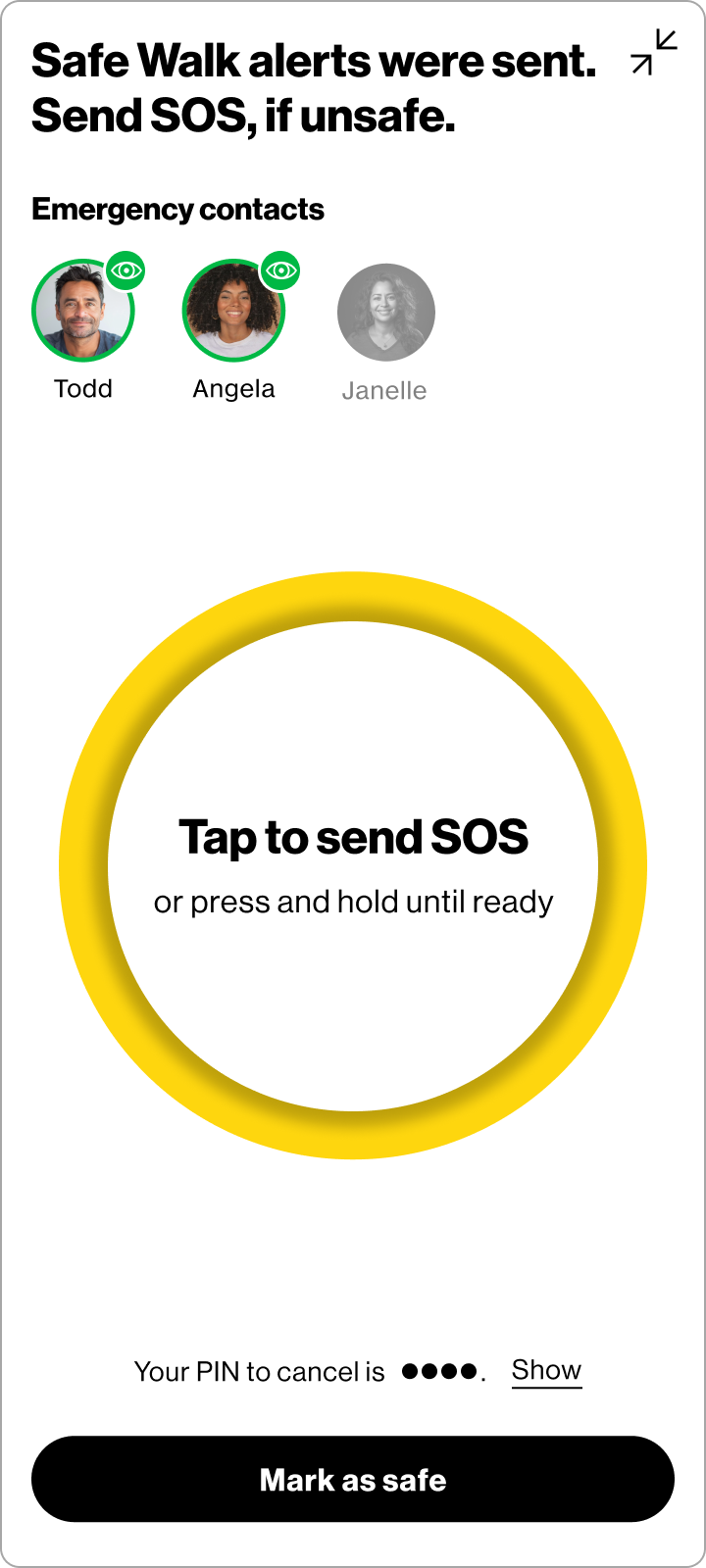
SOS trigger — no confirmation gate. There was internal pressure to add a confirmation step before sending an SOS alert to prevent accidental sends. I pushed back. In an actual emergency, requiring a user to confirm could mean the difference between getting help and not. A false alarm can always be corrected — a missed SOS cannot. We designed accordingly: the SOS sends on tap or with the release of the SOS button, without a confirmation gate, while still providing clear post-send feedback and an easy way to notify contacts that everything is okay.
SOS button size and accessibility. Once a Safe Walk is active, a user shouldn't need to fumble with their phone to reach help. I advocated for a large, thumb-friendly SOS button with clear, minimal instructional text on screen — designed so a user could trigger it with their phone at their side or partially pocketed, without needing to look. Ease of access in an uncomfortable or dangerous moment was the primary design constraint.
Onboarding tutorial. To ensure users felt confident before they ever needed the feature in a real situation, I designed a tutorial walking users through how to start a Safe Walk and escalate to SOS. Safety features only work if people trust them enough to use them — the tutorial was a critical part of closing that gap.
Across iterations, the core feature set remained stable — a sign that early requirements were well-defined. Refinements focused on details with outsized impact on clarity: the size and content of the active state cards, the placement and label of the "Active" indicator, and the language used throughout the flow. Small changes, but ones that meaningfully reduced user confusion in testing.
Sending a Safe Walk and Sending an SOS

Receiving a Safe Walk and SOS

Impact & Learnings
Safe Walk and SOS shipped to hundreds of thousands of Verizon Family App users, giving families a reliable way to stay connected during the everyday moments that matter most. User testing indicated meaningful improvements in task confidence and flow clarity over the course of the project — though specific metrics remain confidential.
What this project reinforced most was that designing for safety means designing for imperfect conditions. Users won't always be calm, focused, or hands-free. Every interaction has to work when it's hardest to use. That constraint made the work sharper — and more meaningful.
Leading design across a year-long engagement also deepened my experience navigating real tradeoffs between stakeholder pressure and user needs, and advocating clearly for decisions grounded in how people actually behave under stress. This remains one of my favorite projects because it's a case where getting the details right genuinely mattered.