Verizon Smart Family - “More Menu”
As part of the UX design team, I led the redesign of the More Menu in Verizon Smart Family — a key hub for profile management, parental controls, and support resources. The goal was to simplify access to critical tools, reduce fragmentation, and create a cohesive, parent-centric navigation system.
This case study outlines the challenges we identified, the design rationale behind our solutions, and how these changes improved usability and parental confidence within the app.
Understanding the Existing Experience
A fragmented structure
The current state experience lacked a centralized location for parents and guardians to manage their family profiles and controls. The parental controls were placed at the bottom of the long home page and all other settings and app info was located behind a settings gear in the top nav.
Limited context and continuity
The current experience is static, allowing parents to view controls and insights for only one child at a time. Several settings and controls lack context, leaving parents unaware of the implications of making changes.
Looking ahead
It became clear that every control and parental setting needed to be unified within a single framework — one that balanced structure, clarity, and contextual access.
Centralizing Navigation
The problem
In the previous app, settings and parental controls were dispersed across multiple screens, creating friction and confusion. Parents lacked a clear mental model for where to find or adjust key controls.
The solution
We introduced a dedicated More Menu, consolidating all parental controls, settings, and app resources into one accessible location. This centralized hub reduced the need for excessive navigation and made the system more predictable.
The More Menu is now accessible via the bottom navigation bar and includes direct entry points to profile-based parental controls — giving parents quicker, more confident access to essential tools.
Current state setting and controls


MVP Design

Defining a Clear Information Hierarchy
The problem
As Smart Family evolved, new features were added without a consistent grouping strategy. Overlapping categories and uneven labeling increased cognitive load and slowed task completion.
The solution
We developed a new information architecture structured around four primary groupings:
Profile Management – devices, family members, and location sharing
Parental Controls – filtering, usage, and scheduling
Help & Support – FAQs, guides, and expert tips
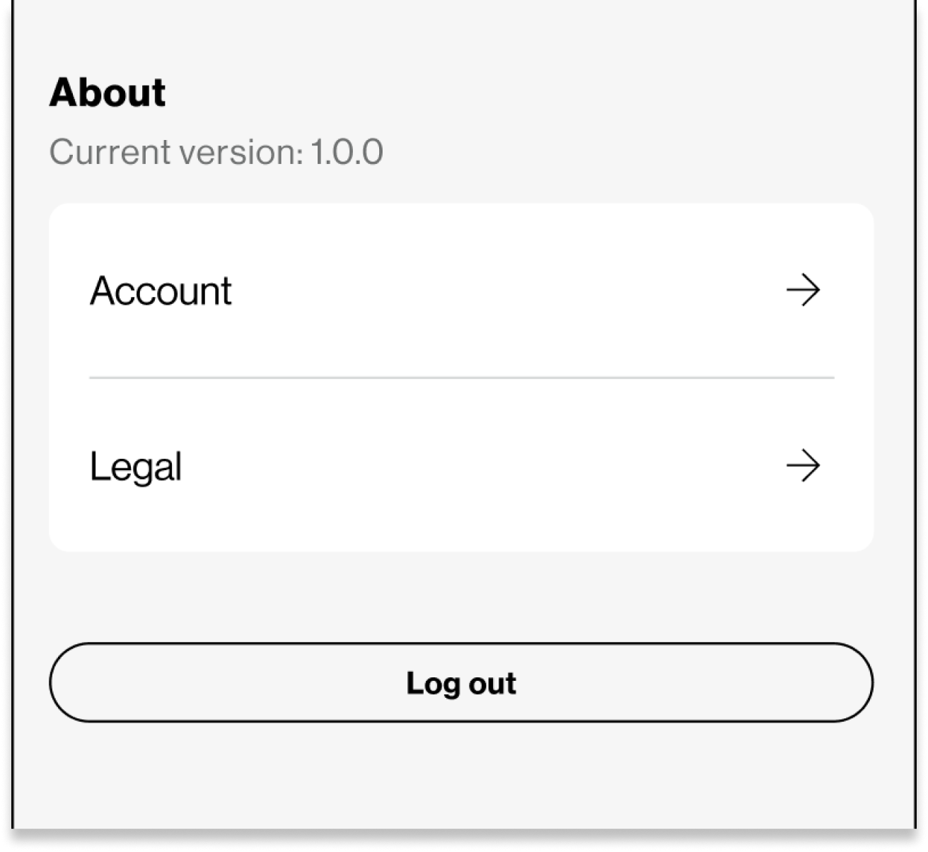
About – account and legal details
Within Parental Controls, we introduced sub-categories such as Schedule Location Alerts and Report Details to organize related tasks and reduce decision fatigue.
This structure, modeled after familiar platform patterns (Apple and Google), enables parents to locate information faster while maintaining a consistent, scalable foundation for future growth.


Designing Contextual Shortcuts
The problem
Many parental control actions were disconnected from the contexts in which parents needed them most. For example, to adjust app restrictions or schedules, users had to leave the page they were reviewing and navigate multiple layers deep.
The solution
We introduced contextual shortcuts that surface relevant actions where parents naturally need them.
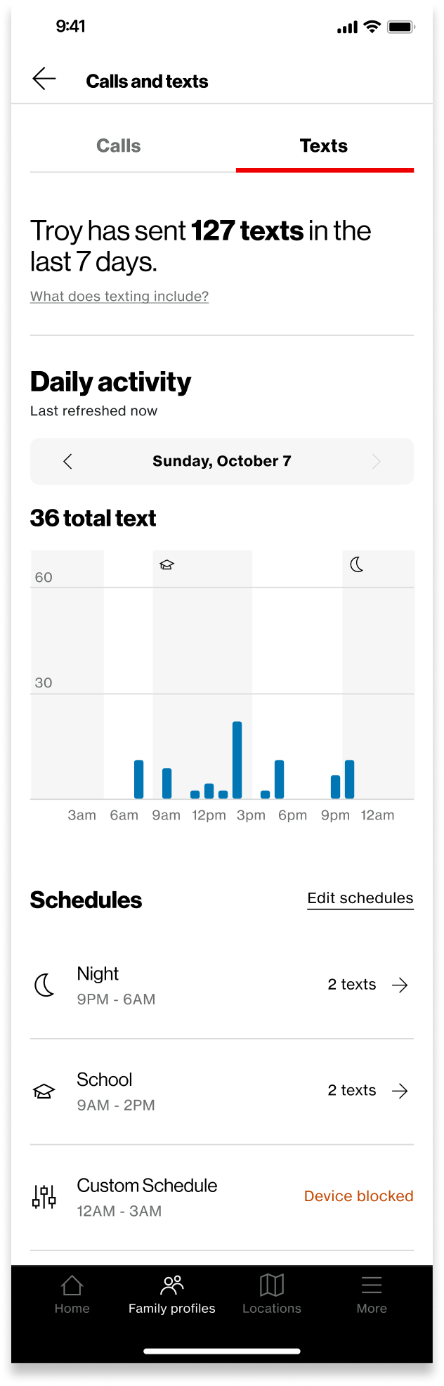
From the Family Profile, users can now access sub-features like Filter Content or Restrict Usage directly. Within Web & App Activity, parents can jump to Schedules to modify time limits or app access. Similarly, within Calls & Texts, shortcuts lead to messaging and scheduling controls.
These lightweight pathways save time, reduce mental effort, and support a smoother, more connected experience across the app.


Impact & Learnings
The redesigned More Menu streamlined access to key controls, simplified navigation, and improved overall usability. Parents now spend less time searching for actions and more time managing their families with confidence.
This project reinforced how powerful clear information architecture can be — not only in improving efficiency, but also in strengthening user trust. Small structural refinements, when grounded in user needs, can create lasting clarity and scalability across a complex product ecosystem.