Verizon Smart Family: More Menu
A redesign of the More Menu in Verizon Smart Family, the central hub for profile management, parental controls, and support. The work restructured a fragmented settings architecture into a clear, scannable hierarchy that made account management feel intuitive for parents for the first time.
Role & Scope
As part of the UX design team, I led the redesign of the More Menu in Verizon Smart Family, a key hub for profile management, parental controls, and support resources. The app was used by tens of thousands of families, and the More Menu is where parents go to manage the people, devices, and controls at the center of that experience.
The goal was to simplify access to critical tools, reduce fragmentation, and create a cohesive, parent-centric navigation system. This work was part of the app's MVP build, shaped by a tight delivery timeline and a feature-parity goal, so the challenge was to bring real structural clarity within a constrained scope. That meant auditing where controls and settings actually lived, understanding how parents expected to find them, and building an information architecture that could hold up as the product continued to grow.
Overview
- Understanding the Existing Experience
- Centralizing Navigation
- Defining a Clear Information Hierarchy
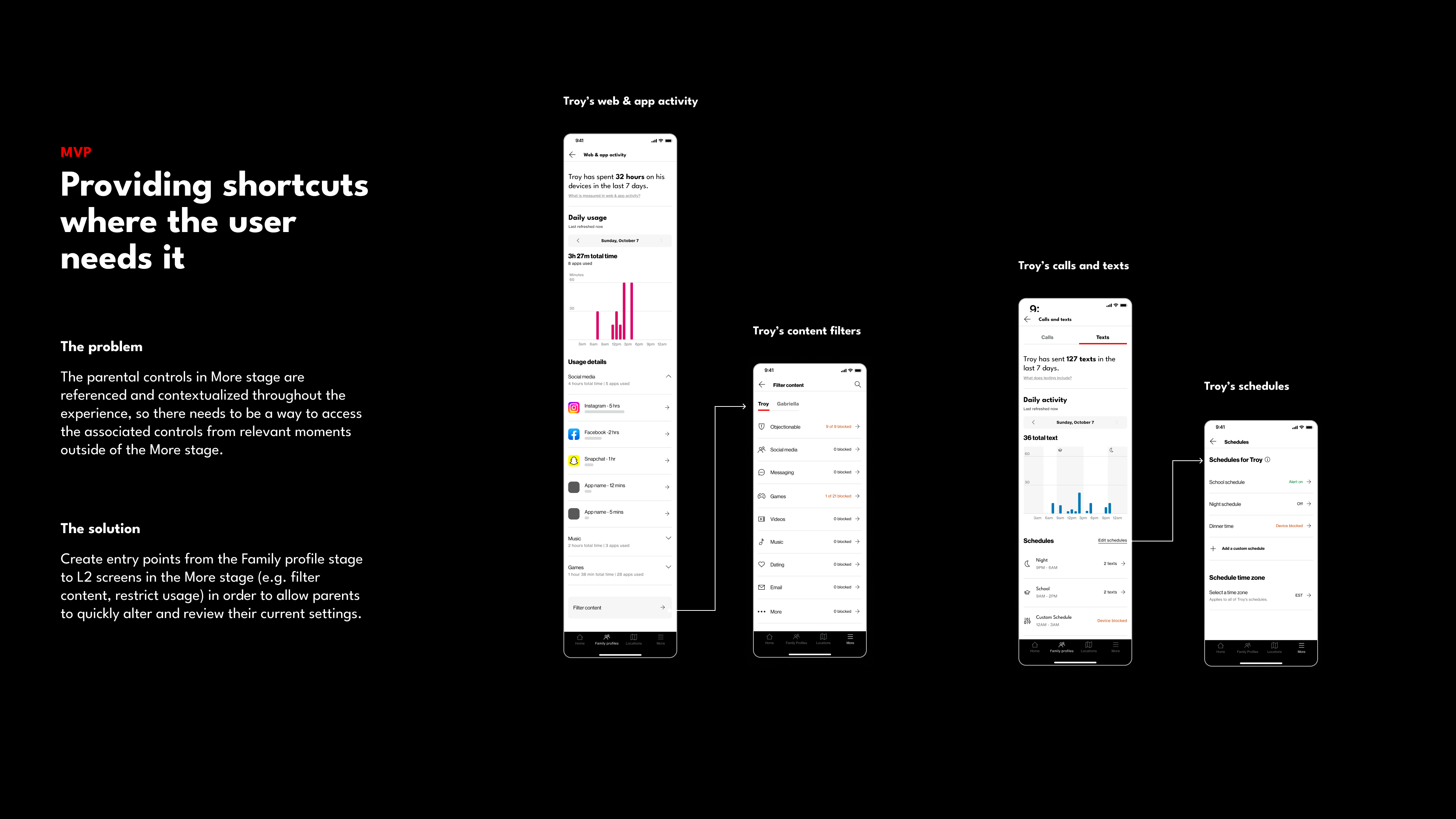
- Designing Contextual Shortcuts
Understanding the Existing Experience
Before proposing anything new, we mapped how the current experience was actually organized, and the picture was fragmented.
A scattered structure.
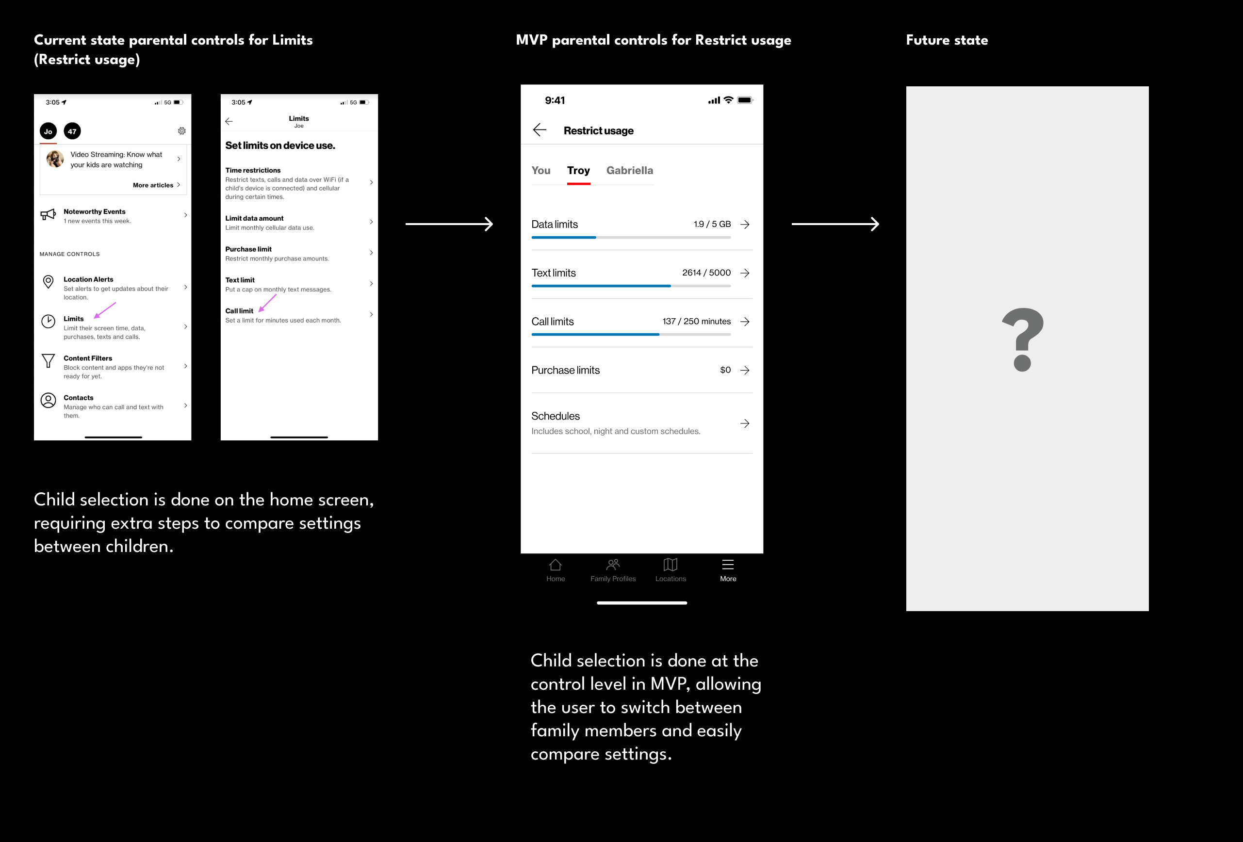
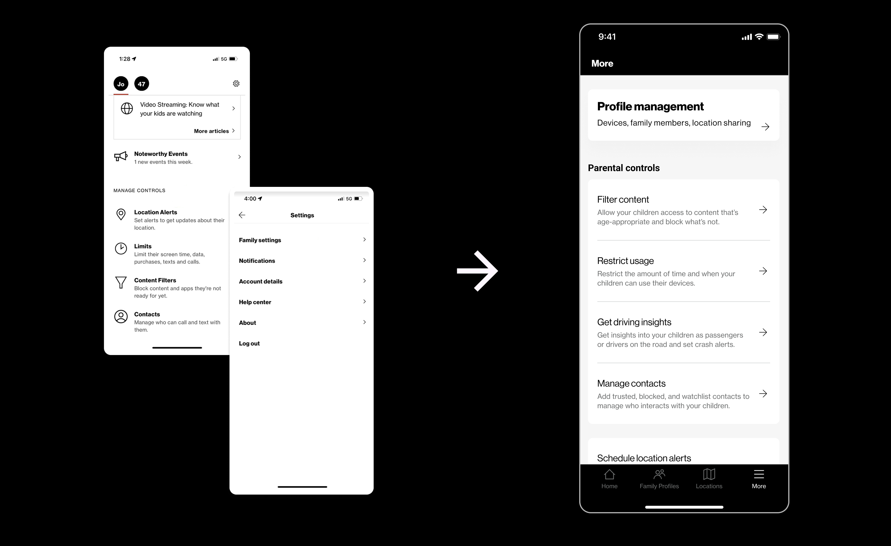
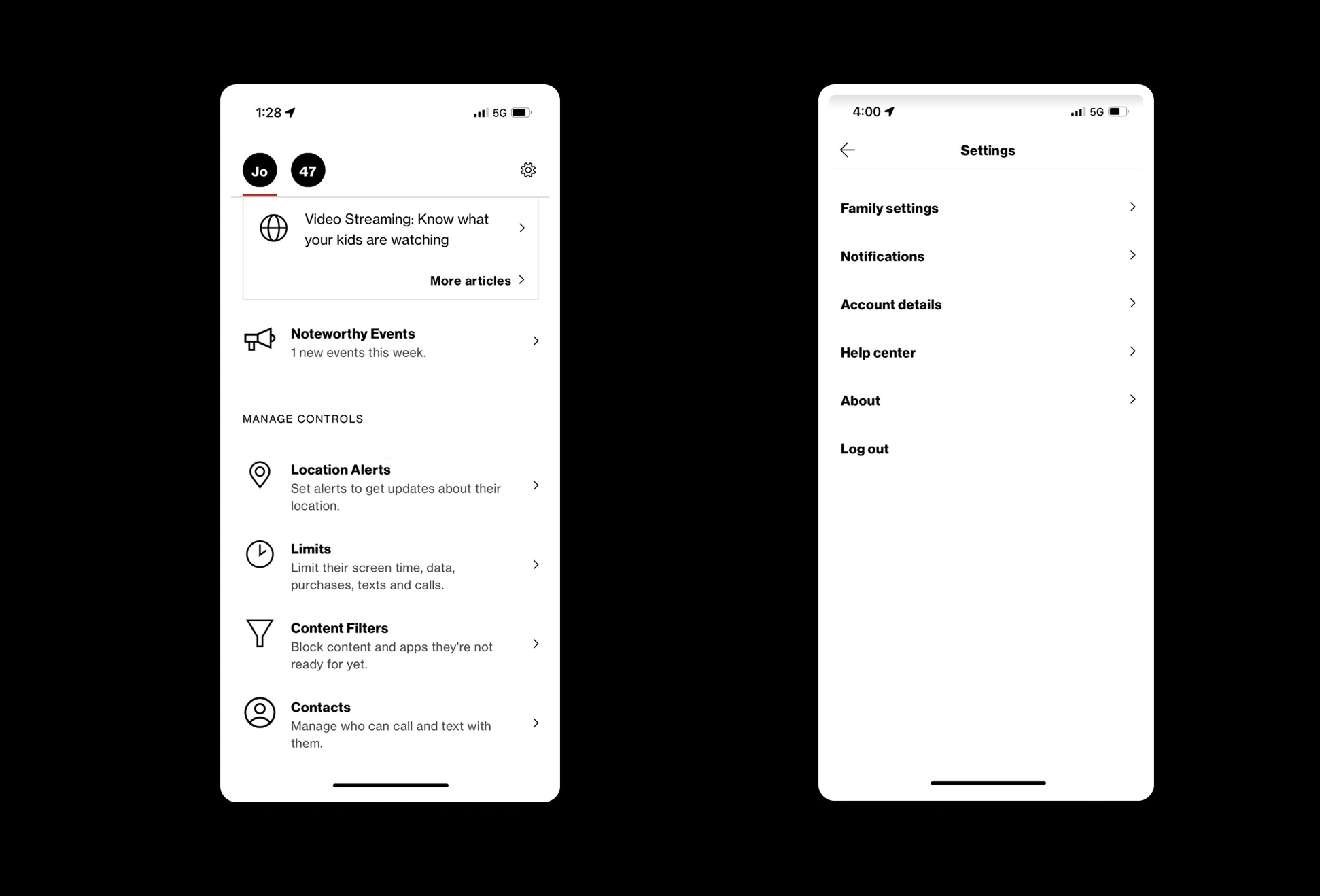
There was no centralized place for parents to manage their family profiles and controls. Parental controls sat at the bottom of a long home page, while other settings and app information lived behind a settings gear in the top navigation. The two most important things a parent came to do were in two entirely different places.
Limited context and continuity.
The experience was static, letting parents view controls and insights for only one child at a time. Several settings and controls lacked context, leaving parents unsure of the implications of a change before they made it.
It became clear that every control and parental setting needed to be unified within a single framework, one that balanced structure, clarity, and contextual access. That conclusion set the direction for everything that followed.
Centralizing Navigation
In the previous app, settings and parental controls were dispersed across multiple screens, which created friction and left parents without a clear mental model for where to find or adjust key controls. The first move was to give all of it one home.
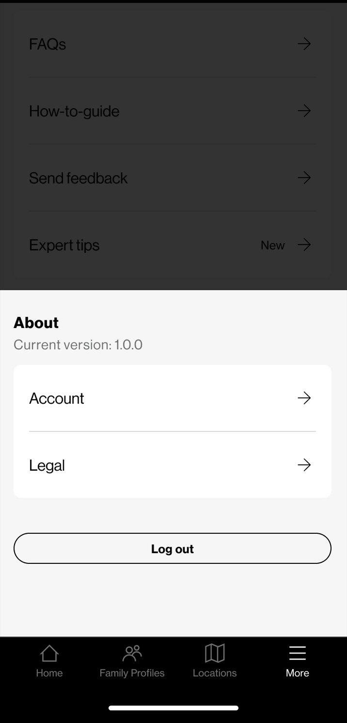
We introduced a dedicated More Menu that consolidated parental controls, settings, and app resources into a single accessible location, reducing the need for excessive navigation and making the system more predictable. The More Menu is now reachable directly from the bottom navigation bar and includes direct entry points to profile-based parental controls, giving parents quicker, more confident access to the tools they rely on most.
Defining a Clear Information Hierarchy
As Smart Family had evolved, new features were added over time without a consistent grouping strategy. Overlapping categories and uneven labeling increased cognitive load and slowed task completion. Consolidating everything into one menu only mattered if the menu itself was legible, so the next step was structure.
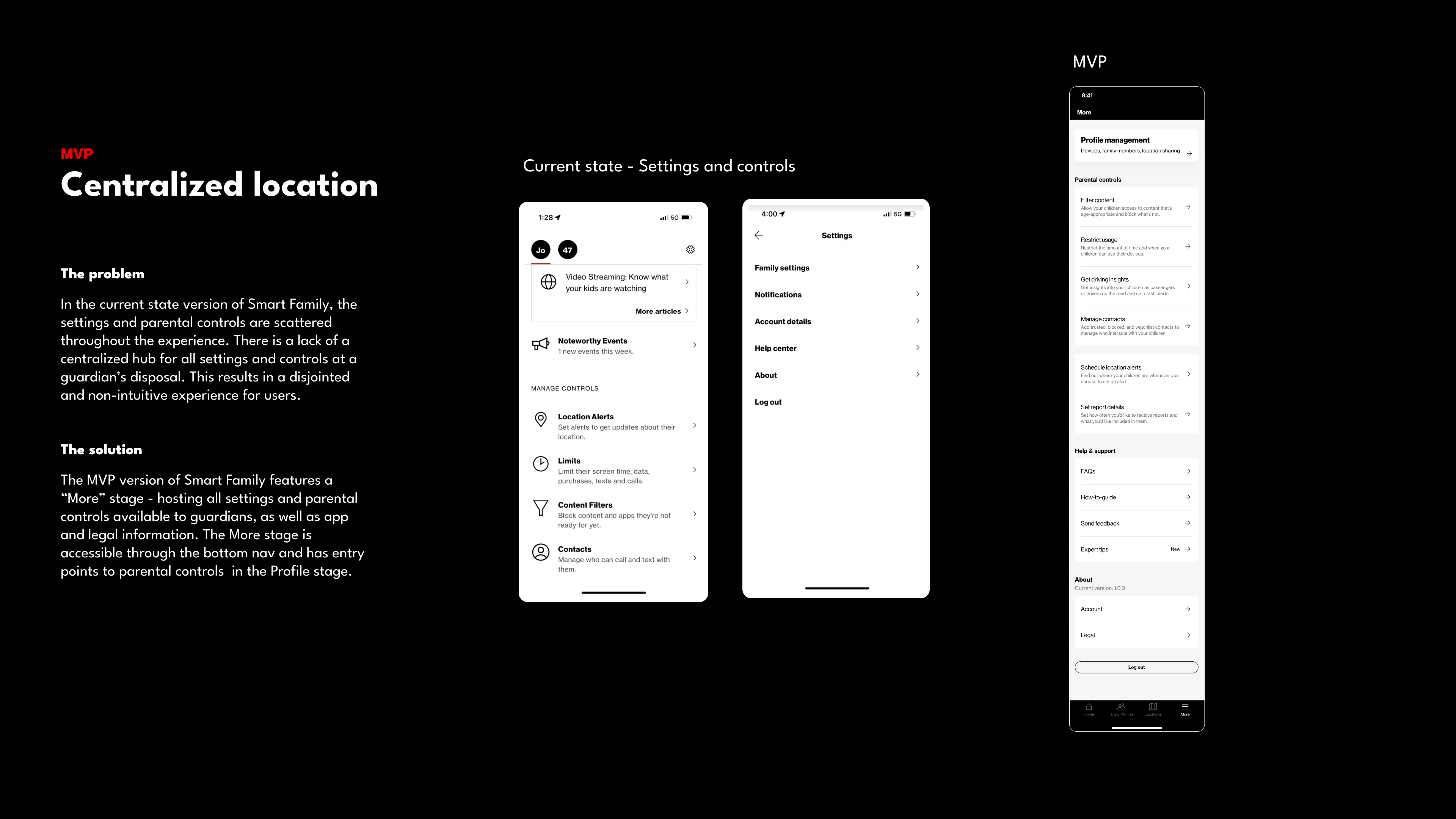
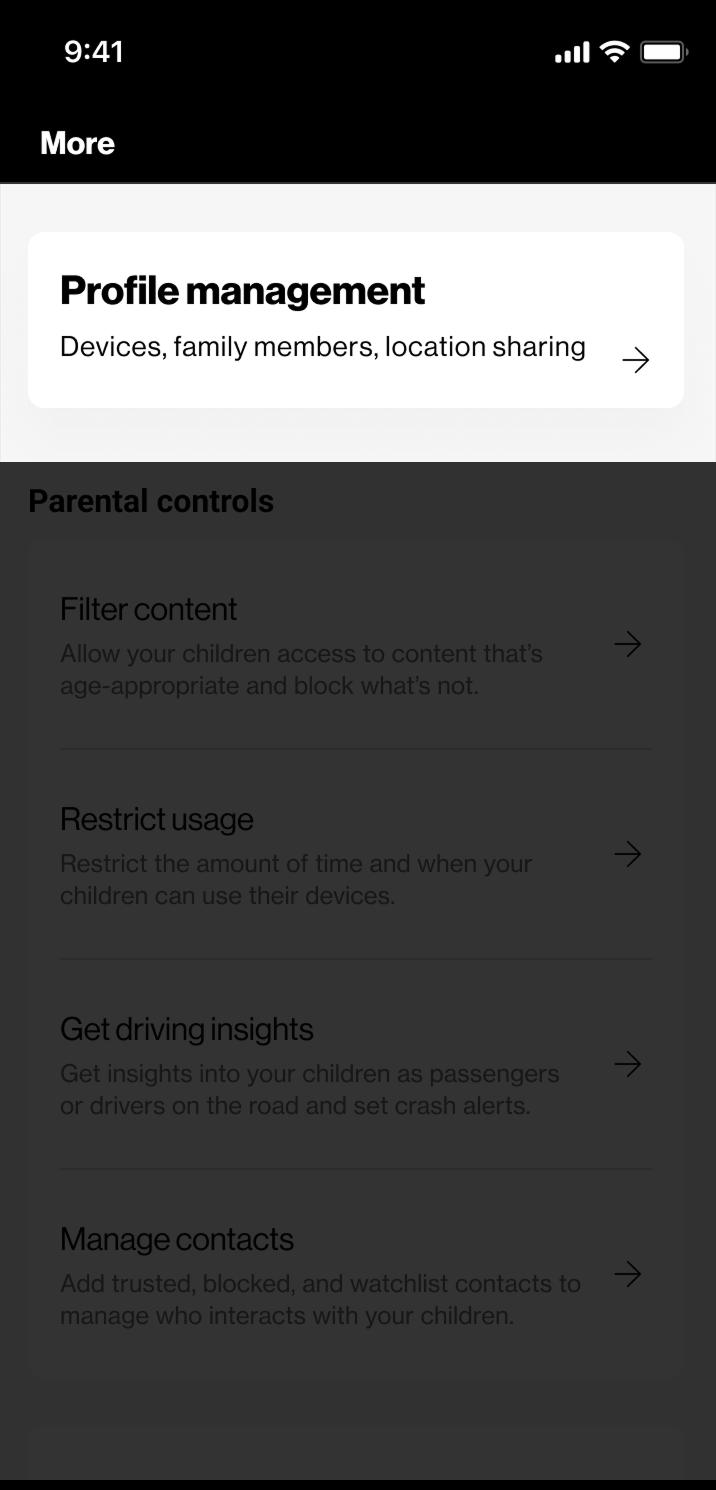
We developed a new information architecture organized around four primary groupings:
Profile Management.
Devices, family members, and location sharing.
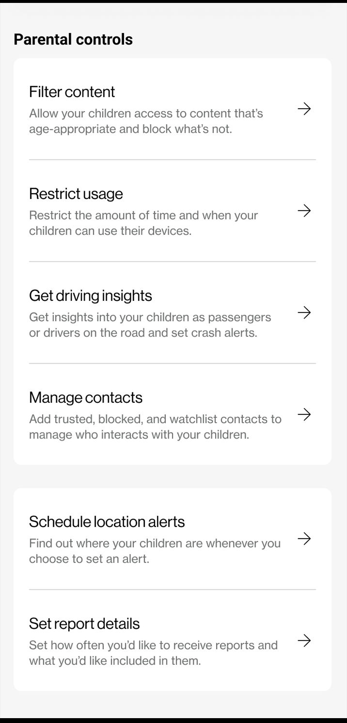
Parental Controls.
Filtering, usage, and scheduling.
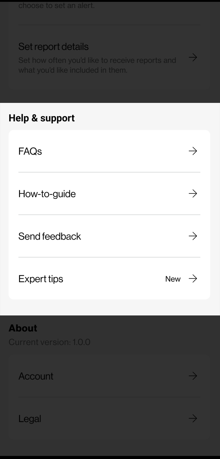
Help & Support.
FAQs, guides, and expert tips.
About.
Account and legal details.
Within Parental Controls, we introduced sub-categories such as Schedule Location Alerts and Report Details to group related tasks and reduce decision fatigue. Modeled after the familiar platform patterns parents already knew from Apple and Google, this structure let them locate information faster while giving the product a consistent, scalable foundation for future growth.
Designing Contextual Shortcuts
Even with a clean hierarchy, many parental-control actions were still disconnected from the moments parents needed them most. To adjust an app restriction or a schedule, a user often had to leave the page they were reviewing and navigate several layers deep to make one change.
We introduced contextual shortcuts that surface relevant actions where parents naturally look for them. From the Family Profile, users can now reach sub-features like Filter Content or Restrict Usage directly. Within Web & App Activity, they can jump straight to Schedules to adjust time limits or app access. Within Calls & Texts, shortcuts lead to messaging and scheduling controls. These lightweight pathways saved time, reduced mental effort, and supported a smoother, more connected experience across the app, so the structure did not just organize the controls but brought them closer to where they were used.
Impact & Learnings
The redesigned More Menu streamlined access to key controls, simplified navigation, and improved the overall usability of a hub that families relied on every day. Parents now had a predictable place to manage their families rather than hunting for actions scattered across the app.
This shipped as the MVP stage of the app, built against a tight timeline with feature parity as a driving goal. Those constraints shaped the scope: the priority was a coherent, predictable structure parents could rely on, not a from-scratch reinvention of every control. Designing well within that boundary, rather than wishing it away, was part of the work.
The MVP also made clear where the next round of effort should go. The profile-selection mechanism, which lets parents apply controls across different children, was implemented simply to fit the timeline. It works, but it is not the strongest solution, and refining how parents select and switch between profiles is the first thing I would iterate on. Beyond that, there is room to rethink parental controls as a system, so that filters, limits, and schedules can be combined or applied to several children at once rather than adjusted one setting at a time. Naming those gaps honestly was part of handing off a strong MVP rather than pretending it was a finished product.
More than anything, this project reinforced how powerful clear information architecture can be, not only in improving efficiency but in strengthening user trust. When a parent always knows where to find a control, they trust the product with something that matters to them. Small structural refinements, when grounded in real user needs, can create lasting clarity and scalability across a complex product ecosystem, and that is often where a designer adds the most durable value.